Navigating the Responsive Realm in Flutter: Insights from a Senior Mobile App Engineer


Introduction
Remember the last time you opened an app on your phone and found it awkwardly stretched on your tablet? 🤔 That's the challenge we tackle head-on in Flutter's responsive UI design 😎
In the ever-evolving landscape of cross-platform application development, the art of crafting responsive user interfaces (UIs) is more crucial than ever. Flutter, with its robust toolset, stands as a beacon for developers striving to build apps that are as responsive as they are functional. This guide delves into advanced strategies and best practices for senior developers aiming to harness Flutter's full potential in responsive UI design.
Flutter's Flexibility: Beyond Basics
Imagine you're building an app that needs to look great both on a compact phone 📱and a spacious tablet. Here's where Flutter's versatility shines🌟, allowing us to craft UIs that adapt seamlessly to any screen.
Flutter's widget-based architecture offers a compelling approach to constructing UIs that are both adaptive and visually stunning. But to truly leverage this power, one must think beyond the basics.
Advanced MediaQuery Techniques
Think of MediaQuery like a chameleon 🦎, adapting its layout colours and patterns to blend seamlessly with the environment in our case, the device's screen.

A senior developer's use of MediaQuery transcends simple ternary operations. It involves crafting a nuanced understanding of device profiles and user environments, ensuring layouts that are not just responsive, but also intuitive and user-centric.
Widgets at Work: Crafting Sophisticated Layouts
Let's consider an app whose layout fluidly adjusts as you rotate your device 🔄. That's the power of strategically using Row, Column, and Container widgets.
Best Practices for Complex Layouts
Nested Flexibility: Harness nested
RowandColumnwidgets to create complex, yet fluid layouts.Custom Responsive Widgets: Develop custom widgets that adapt their properties based on the screen size, creating a truly dynamic UI experience.
Fluid Typography and Imagery: A Deeper Dive
The difference is like night and day 🌓: text that zooms in and out gradually with screen size, ensuring readability and visual appeal across all devices.
Responsive design isn't just about adjusting layouts; it's also about ensuring that text and images scale elegantly across devices.
Code Example: Responsive Text Styling
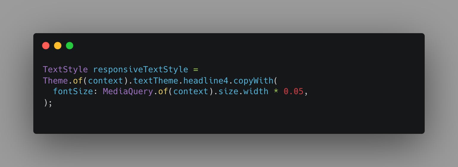
This snippet illustrates the concept of fluid typography, where the text size scales in proportion to the screen width, maintaining legibility and aesthetic appeal across devices.
Testing: Ensuring Universality
During my testing phase on real devices 📲, I discovered an overlooked aspect of UI that transformed our app's user experience on tablets.
As a senior developer, one of the approaches to test responsive UIs involves a comprehensive strategy that extends beyond the emulator. This includes:
Real Device Testing: Validate UIs on a range of physical devices.
Automated UI Testing: Implement automated tests to ensure UI consistency across different screen sizes and orientations.
Advanced Tools for Responsive Design
Leveraging LayoutBuilder

The LayoutBuilder widget is a powerful ally, providing constraints that inform more adaptive and context-aware layouts.
Bridging Design and Code with Figma to Flutter
For a seamless transition from design to code, senior developers often utilize tools like the Figma-to-Flutter plugin. This facilitates the direct conversion of design elements into Flutter code, streamlining the development process.
Embracing a Responsive Mindset
Responsive UI design in Flutter is not just a technical skill; it's a mindset. It requires an appreciation of the diverse ways users interact with applications across different devices. This mindset leads to the creation of apps that are not only functional but also delightful to use, regardless of the device. 🤌
Conclusion
As we journey through the ever-evolving world of Flutter, let's embrace the challenges and triumphs in responsive UI design 👐, crafting apps that aren't just functional, but a joy to use 😊.
Further Exploration
Dive deeper with the Flutter Responsive Framework 🌐 to uncover hidden gems in responsive design, or check out the Responsive Builder 🔨 for hands-on, practical solutions.
Follow me on Twitter (X): @gideonsalamii